
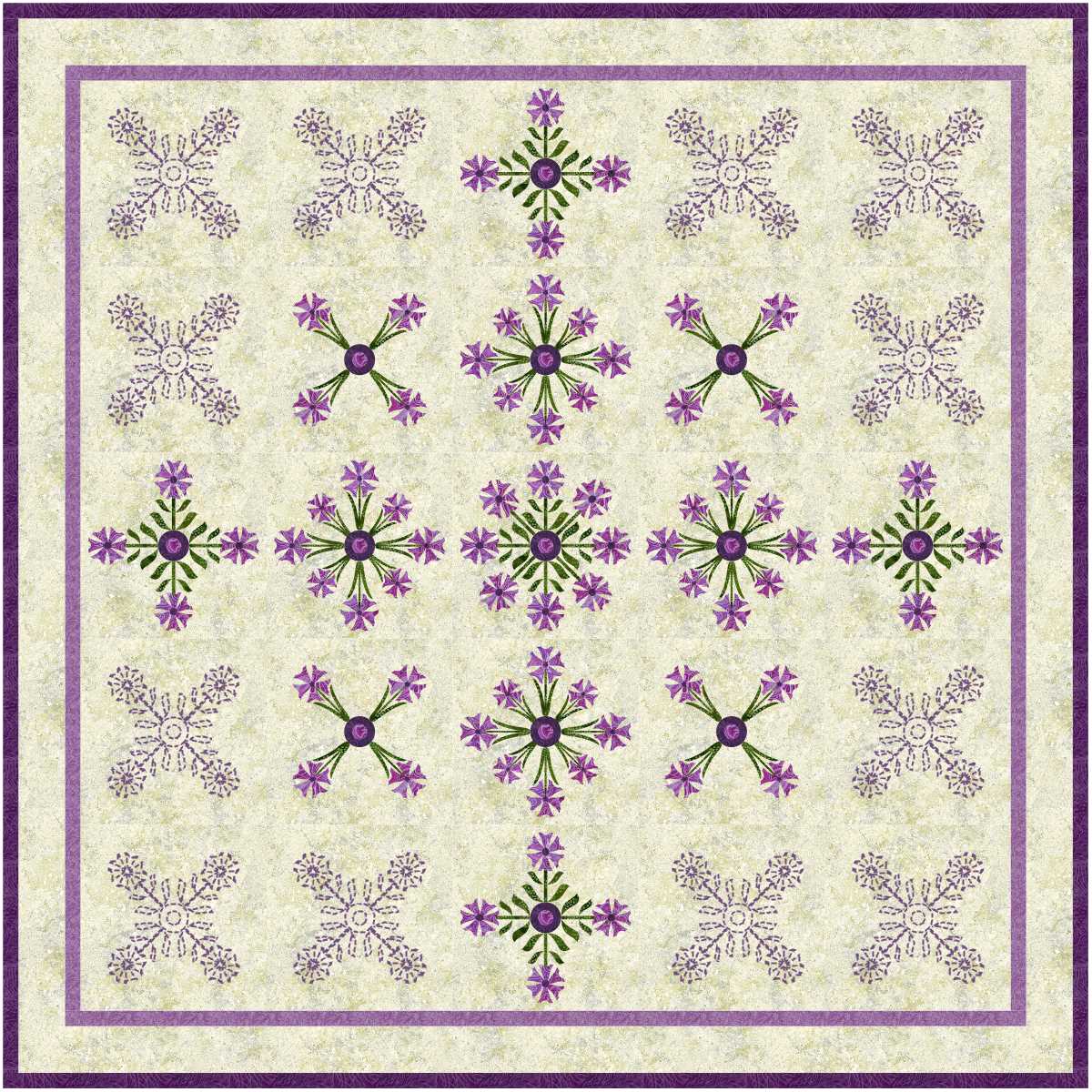
The design above was a mistake. The design below was what I intended to do.

I much prefer the first one! Sometimes mistakes are beneficial.
Which one do you prefer?
read more
The design above was a mistake. The design below was what I intended to do.

I much prefer the first one! Sometimes mistakes are beneficial.
Which one do you prefer?
read more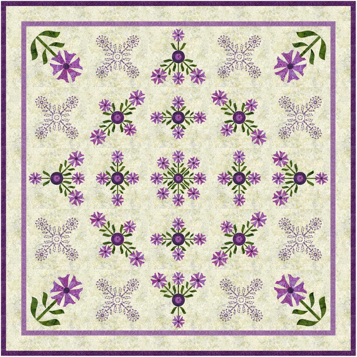
A very nice start!
Where I use applique designs as quilting motifs there are lots of spaces left between those motifs. Those background spaces would be filled with filler such as cross hatching in a thread to match the background The applique outlines may also be done it matching thread, but could be done in a low contrast thread.
First lesson learned is that I don’t like the long skinny leaves near as much as the short leaves, and the two do not mix well.
read more
Very dainty.
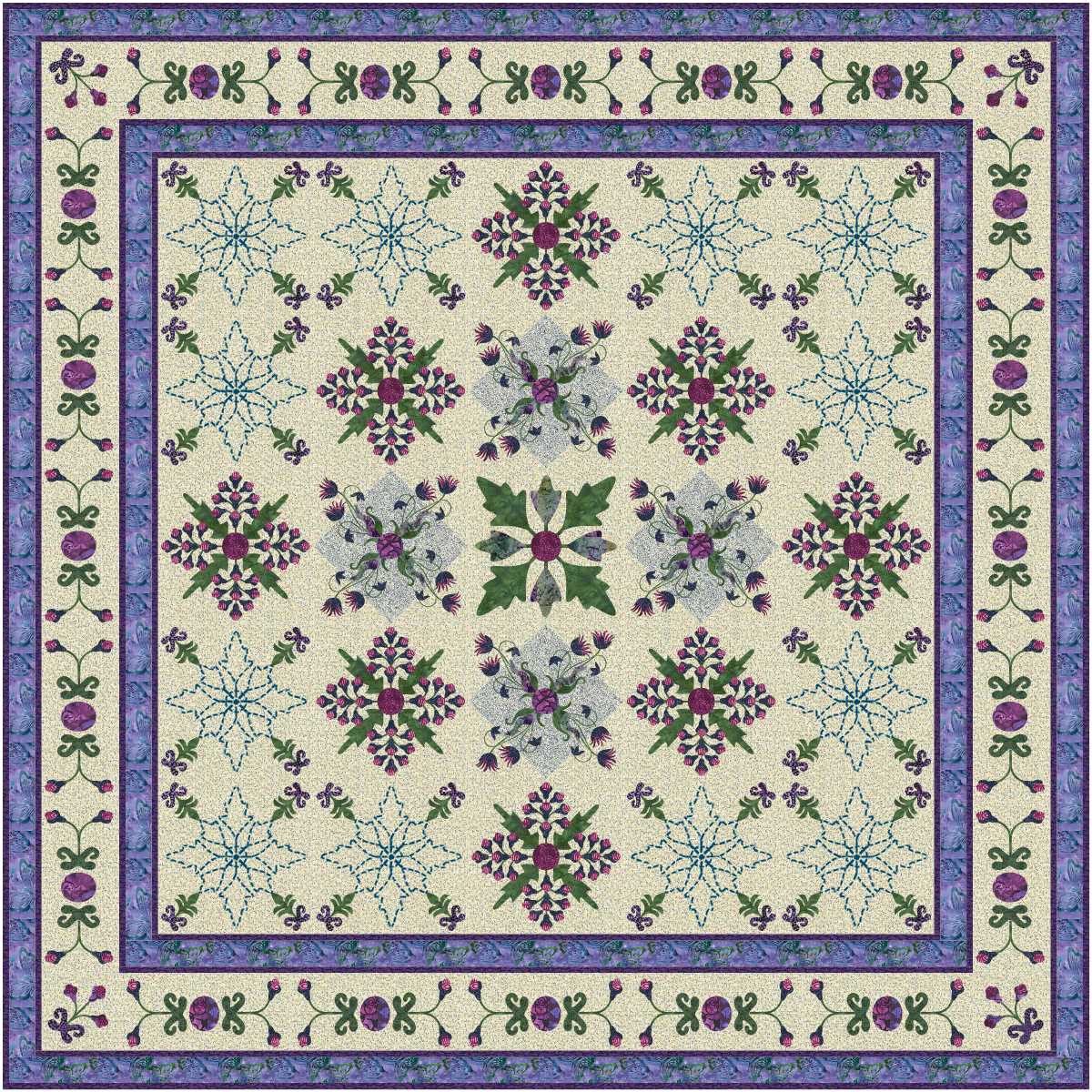
More blocks, lots of detail, and I think this design is one which will remain forever virtual.
read more
These designs have a very lacy look, which is why they got the title from Aunty Flo, as she did a lot of tatting.
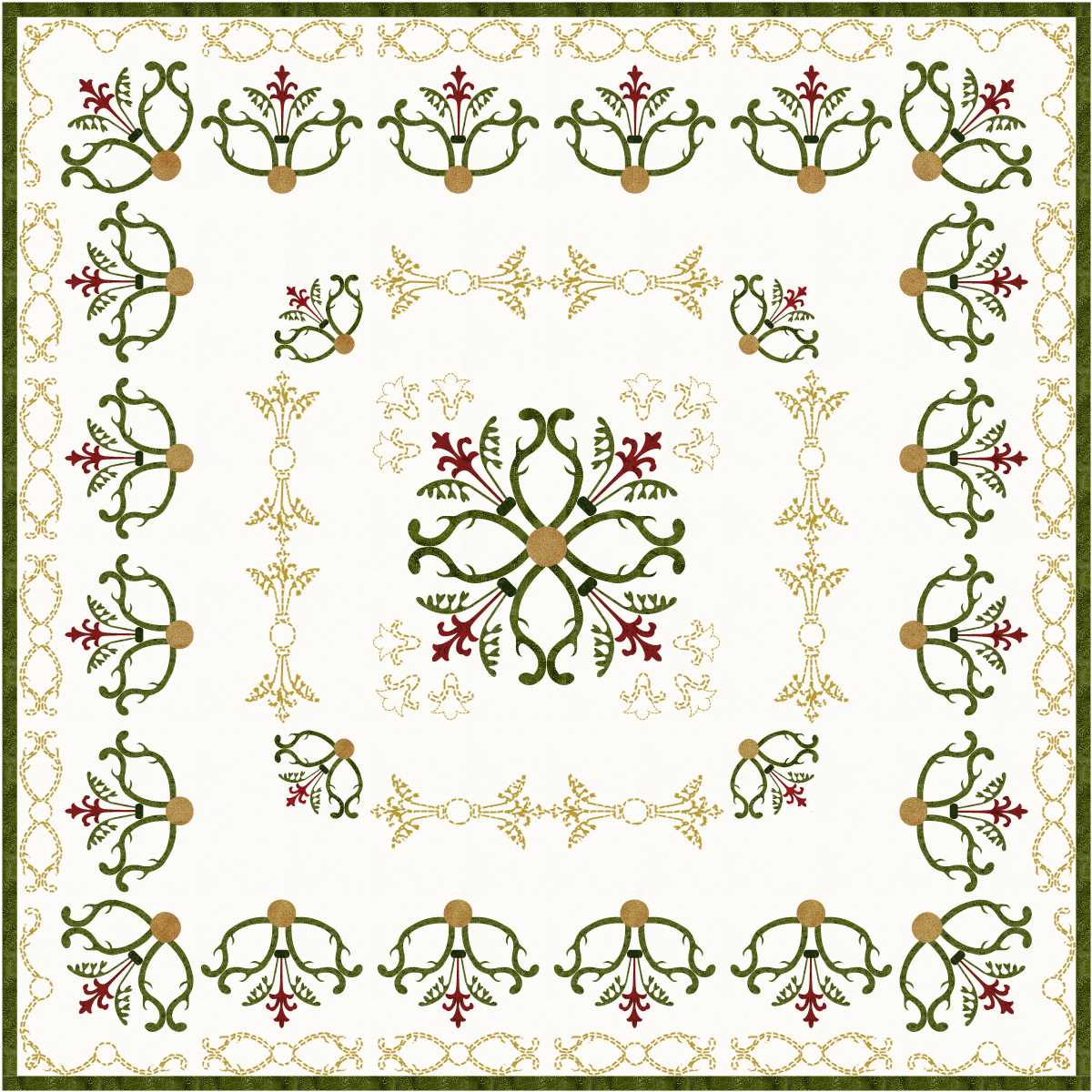
Lovely!
read more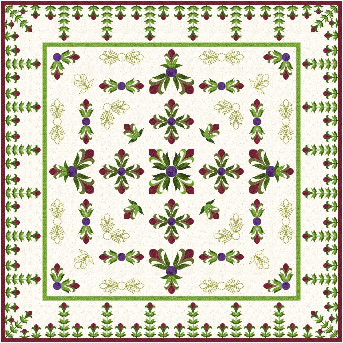
As I selected this design I thought I really liked it. Then I moved attention to the next design.

I love the second design.
I have worked out what I want for Christmas … a magic wand which would create a quilt every day, but even then I will never catch up with all the virtual designs I would like to make real.
read more
My garden features lots of pink, and lots of green … far too much as much of the green at the moment is weeds.
However, in virtual and real quilts I can limit the amount of green, and I love the results.

Less blocks, smaller quilt unless the blocks are enlarged, but still pretty.
read more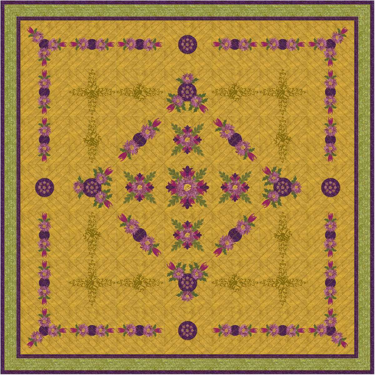
I like these designs, but in close up detail the applique is just a little too detailed for anything but fused!
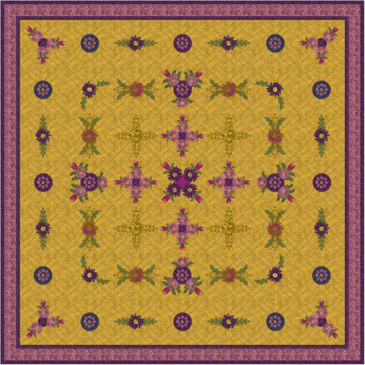
Love the second design.
read more
I selected some pale fabrics with minimal contrast, and started playing. If I live long enough I will make at least one example of these designs.

The hardesst part will be selecting a design, not the fabrics. I cannot pick a favourite in today’s selection.
Selecting fabrics might take time, but will be fun, as I hope I will have to visit more than one shop! Perhaps I should limit myself to one fabric per shop!
read more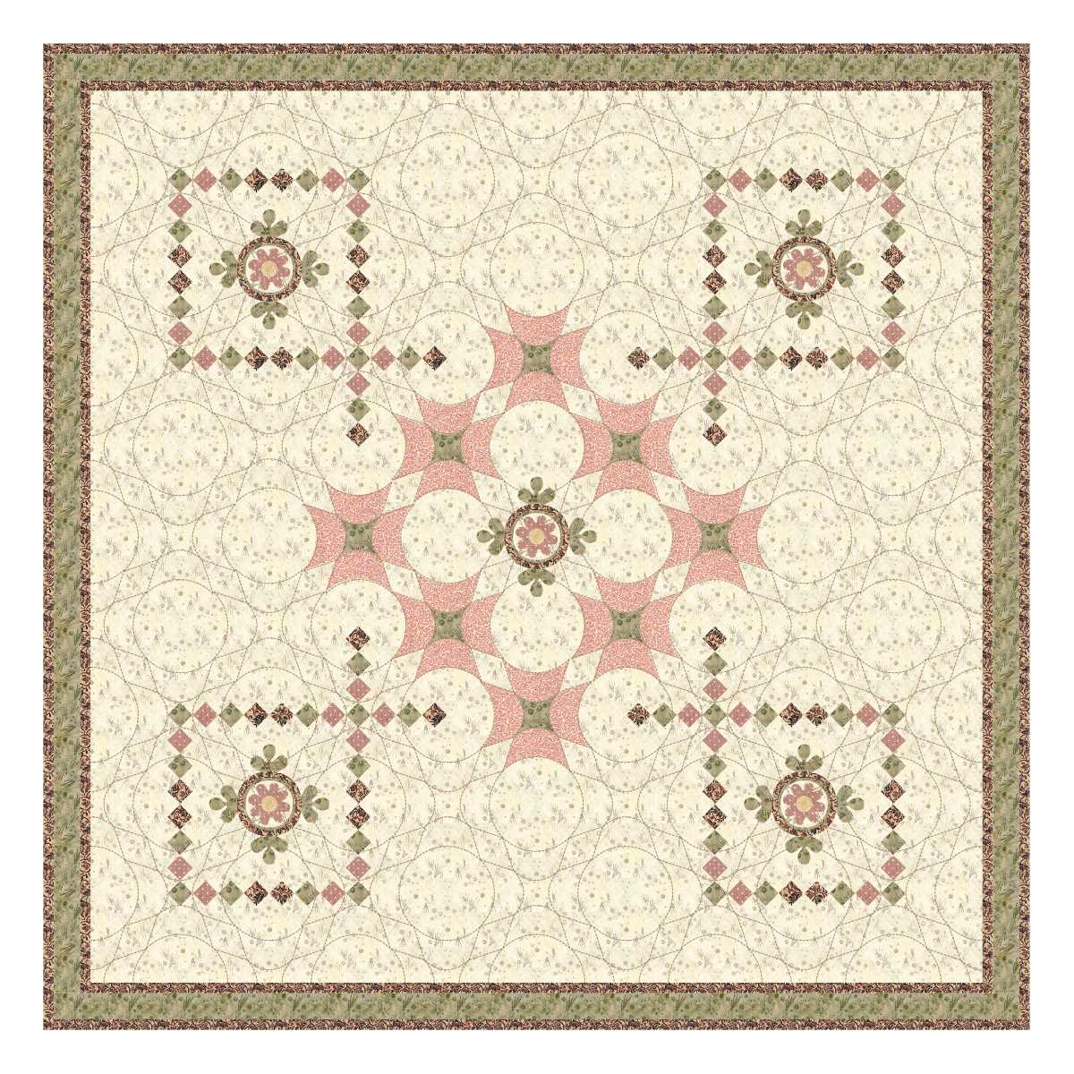
I love the ‘sashing’ effect of those lines of little squares!
Also love the pieced block design filling in the blank spaces as quilting.

The second design uses the little squares more like a border, and they are still very effective.
read more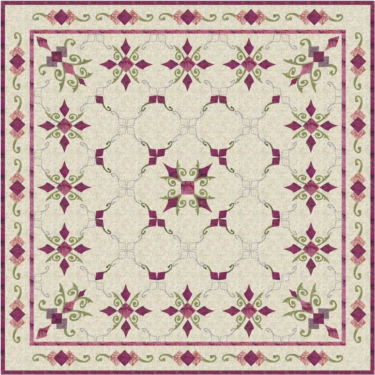
Love it. Looks like an old quilt even though it . never been made
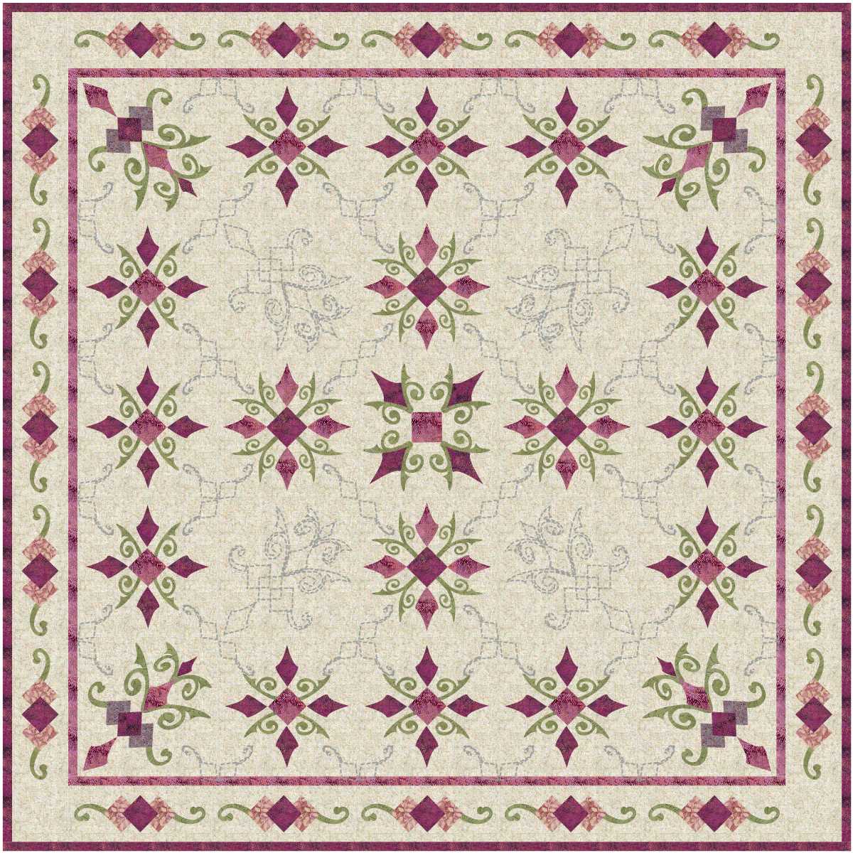
Love the change in the quilting motifs in the second design.
read more
Wow, interesting!
The spaces between the quilting lines I would quilt with thread to match the background, while the quilting designs as shown would be in a strong contrast colour.

Love the second one!
read more
Strawberries on a bed of chocolate, and the quilting looks abit like caramel topping drizzled over it all.
Pity I have already had breakfast … sounds like a delicious way to start the day, and strawberries are healthy food!
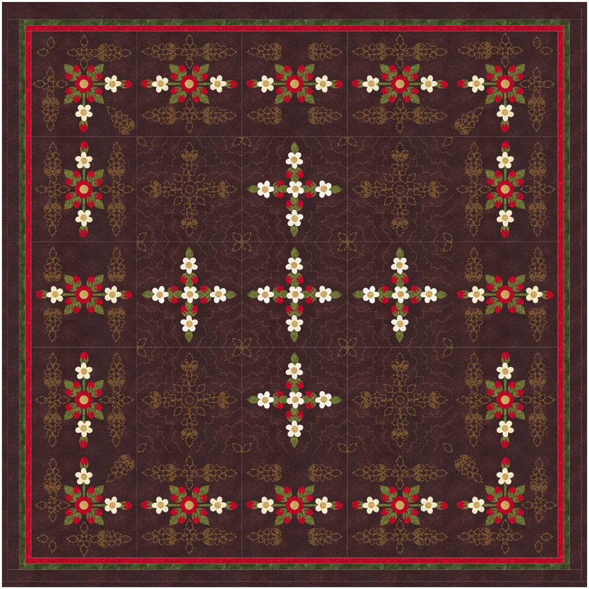
Love the second design.
read more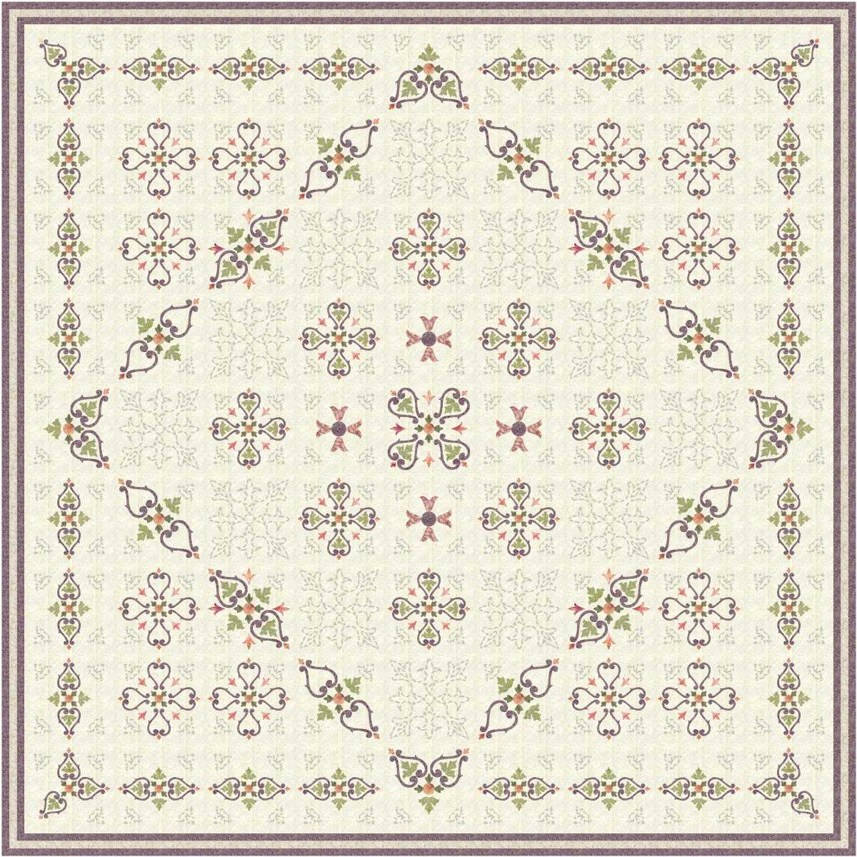
I love the first design … very pale colours on an even paler background … so pretty, and restful.

Still love the second with a heavier border, but the soft contrasts still appeal to me a great deal.
read more
I like my Christmas quilts to be used throughout the year, particularly in winter … Christmas Down Under is in the middle of summer, and often the quilts are kicked off the bed while Father Christmas is doing his rounds, so slightly Christmas colouring and maybe some stars, angels or wreaths would be my choice.
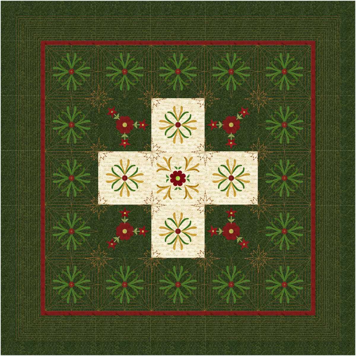
I prefer the second design today.
read more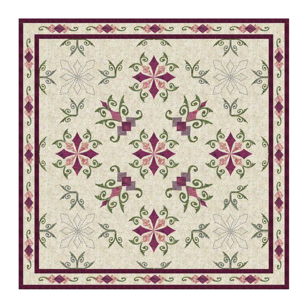
Interesting!
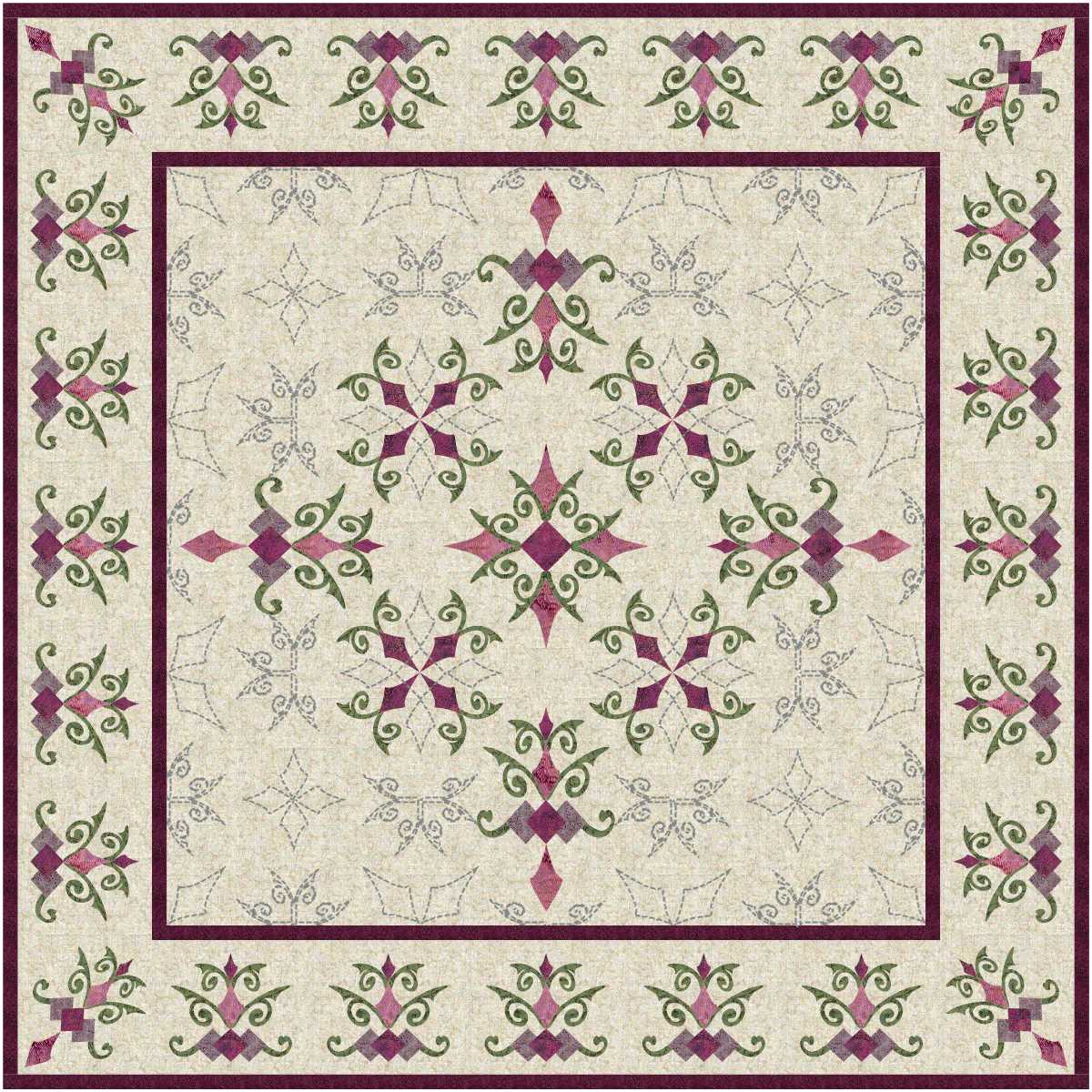
Love it! Intricate applique and quilting in the centre and lovely applique in the border, and other than outlining the applique pieces the only quilting in the border would be cross hatch!
read more
I like the first design of the day.

Also like the second!

My favourite of today’s mix … love it!
read more